Landing pages: the art and necessary science

The sad truth about landing pages… Most people have done it: built really cool and well-thought-out search programs (or social media ads), spent hours on keyword research, carefully crafted the perfect ad copy… and then pointed that ad right at the home page of our website.
The fact is, when we don’t use a landing page, we’re cutting the effectiveness of our marketing campaigns by a significant percentage. How much? It’s hard to quantify, but I’d hazard a guess that this tactic leeches at least 50% or more of the possible impact out of a campaign.
It’d be like running an ad for a room at the Ritz Carlton, painting a fantastic picture of the great accommodations awaiting you… the marble bathroom flooring, the golden fixtures, goose-down pillows, nightly turn-down service… heck, even describing the little chocolates on your pillow (I love those!). But when you arrive at your destination (i.e. when you click on the ad), it turns out you’re actually at a Motel 6. Don’t get me wrong, I’m not slagging Motel 6- they provide great value for the money, and there’s nothing wrong with their rooms. But it’s absolutely not what you expected when you read that ad.
Ideally, if you click on our fictional ad describing a sumptuous Ritz Carlton room, you’d end up on a page that goes into a bit more detail about the room, and builds on the experience the ad started to describe. That marble floor? It was quarried in the city of Carrara. That little chocolate on your bed? It’s Patchi, one of the best-selling chocolate brands in the world. And there would be a way to book that very room, right there on the page.
In other words, you’re moving the customer a little farther along the funnel—and increasing your chances of converting them from a customer into a buyer. And you’re absolutely not forcing them to go find the information they want and need.
Aside from just being a common-sense kind of thing, there are some very tangible benefits to having a quality landing page experience:
- Your ads will convert more effectively. If your customer clicks on an ad and gets more or less exactly what they’re hoping to find (in other words, more information on what your ad or social media post started to tell them), then they’re more likely to stay and less likely to bounce without taking the action you want them to take (more on that in a minute). On the other hand, if your ad just dumps your customer on your homepage, then you’re forcing them to dig through your site to find what they’re looking for. I don’t know about you, but I don’t have a ton of time for stuff like that… And by the way, this will also increase the overall bounce rate of your website, muddying the water so that it’s hard to see how the site is actually converting from an organic perspective.
- Your ads will ultimately cost less. If your landing pages convert well, then you’ll need to spend less to get the results you’re looking for, and your customer acquisition cost will be lower overall.
- You’ll earn a higher ad quality score for your PPC campaigns. Google is always watching… especially if your Google Ads and Analytics accounts are connected. They’ll reward you for higher conversion rates and longer time-on-site by giving you better frequency, placement, and cost. (And ultimately, all these stats should also help your organic rankings.)
OK, what are some key elements that should be a part of every good landing page? Like many things in life, keeping it simple is key:
- Make sure to include a single, highly relevant call-to-action. Trying to get people to book a room at the Ritz Carlton? Include a prominent “BOOK NOW” button on the page. Heck, put a couple of ‘em on the page, one above the fold and one lower down on the page. And always make sure that button works (and links directly to the booking system in this example.) Resist the urge to add multiple calls-to-action. Don’t muddy the waters for your customers – point them where you want them to go. Again, keep it simple!
- As already covered above, make sure the content is highly relevant to what’s described in the ad/post that leads them to the landing page. Pictures are always good, but as we’ve said before, people aren’t going to take the time to read a ton of copy (or watch your 15-minute long video that you spent so much time and money producing)
- Include a little social proof in the form of a short testimonial. Humans are herd animals and we love to be reassured that others have had a positive experience: “That was the best darn chocolate I’ve ever had—I slept like a baby after eating it! – John Q. Public”.
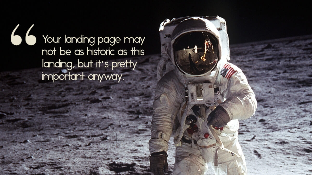
In short, in these days following the 50th Anniversary of the Apollo 11 mission that landed men on the moon for the first time, we at Urban Sherpa Marketign Co. want to encourage you to create your own highly memorable and effective landings of your own. And while we can’t promise you a place in the history books, we know you won’t have to put on bulky spacesuits and leave the Earth to achieve your marketing goals.
Unless, of course, you’re Elon Musk.
Happy small business marketing!
Theron & Katie
At Urban Sherpa Marketing Co. we offer marketing advisory, strategic planning, and services for small businesses and startups, including content marketing. Our goal is to make high-quality marketing possible for every business, no matter the size. Think of us as your outsourced marketing department, strategic marketing adviser, or even your phone-a-friend marketing lifeline. We specialize in building efficient marketing programs to grow your business without blowing the bank.
Share this on:

