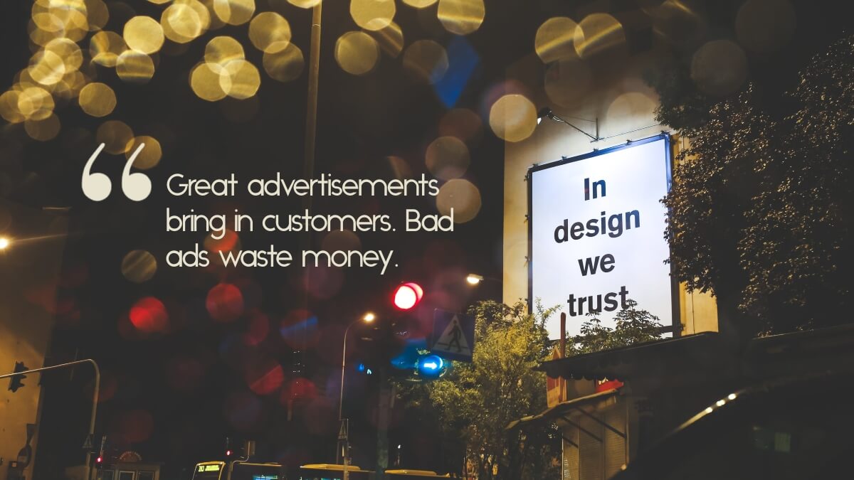
The small business guide to making a great advertisement.

Let’s talk about advertisements. On a macro level, there are two parts to effective marketing: deciding the right things to do, and then doing them well. Or, in other words, strategy and execution.
We talk a lot about strategy around here (maybe too much?), so it’s probably time to talk a little more about the execution part.
For instance, let’s talk about ads. Let’s say you’ve decided where to place an ad, and bought the ad placement (in the local paper, on the web, on social media, or heck, maybe on the side of the bus)… now how do you make sure you’re not wasting that investment?
It’s actually not as hard as you might think to develop an effective ad. Here are a few tips:
Ad dos:
- Put yourself in the mind of your perfect customer. Think about what would they would care about. If you were them, what would make you respond to the ad? Be critical.
- State your value proposition clearly and succinctly. What value do you bring to your customers? What matters to them? Again, make sure you’re thinking like a customer, not talking about the things you care about most.
- Use great, eye-catching imagery. If you’re a house painter, use before and after shots of your work (everybody loves before and afters). Do you sell pretty things? Invest in good photography of a few of your products. Same for restaurants; take mouthwatering pictures of a few of your most popular dishes (Ba Bar in Seattle does this really well). In today’s media-drowned world, you have to up your game when it comes to imagery.
- Put some thought into your headline: it should be strong and impactful, but also make it clear what the ad is about. Witty is good, but don’t sacrifice clarity on the altar of wit unless you’re really good at this advertising stuff.
- Remember your name, logo, tagline, and contact information (or call to action button, for web). You’d be surprised how many people forget the basics.
- Make sure the most important information is the most prominent. Don’t make the least important thing on the ad the thing people see first (and therefore remember). Usually, your headline and your call to action are going to be your most important parts.
- Consider a call to action*. What do you want people to do when they see your ad? Call you? Click on a button? Visit your website? Make sure you clearly tell them what the next step is.
Ad don’ts:
- Talk only about yourself. Remember, nobody cares about you, or your business. Instead, they care about what you and your business can do for them.
- Write too much. The last thing people want is to see a big chunk of text they need to wade through. And trust me, they won’t read it. If you absolutely MUST include a bunch of information, break it up in chunks or use bullets.
- Try and do the graphic design yourself. Yes, we mean this. Just because you can use Photoshop doesn’t mean you can create a professional-looking ad. And as something that will make your first impression to potential customers, don’t you want it to be professional rather than amateur? Don’t skimp on this one.
- Cram in too much stuff. We see this all the time; businesses want to make so many points that the result is cluttered, has no clear hierarchy of information, and is the visual equivalent of a headache waiting to happen. Remember your ad has one job: to get people to contact you or look at your product, and you don’t need to tell them all the nitty-gritty details to make that happen (that’s what your website is for). Less information is actually often better, because you can direct their focus on the most important point(s). Take a look at these brilliant ads; getting people intrigued is a large part of the battle.
And there you have it.
OK, sure, there’s an art to great advertising, and you may never win a Clio award just by following these guidelines. But people spend hundreds of thousand of dollars hiring the best and brightest advertising minds to create that stuff. And that’s all fine and good, if you have hundreds of thousands of dollars.
But if you leave your MadMen aspirations aside, it’s not that hard to create a good, solid, hardworking, and effective ad. And, frankly, effective is what matters.
Happy small business marketing,
Katie & Theron
*you’ll notice we say, “consider a call to action”. We take the somewhat unpopular position that not every ad needs—or, frankly, should have—a call to action. Seriously, it’s a weird knee-jerk reaction people have: pull a string, and the puppet shouts CTA! We do like the rigor of thinking about what you want people to do with an ad, however, because it reminds you of the ultimate purpose. But that doesn’t necessarily mean you need to go out of your way to force one to work. More on this in a later post. I promise.
At Urban Sherpa Marketing Co. we offer marketing advisory, strategic planning, and services for small businesses and startups. Our goal is to make high-quality marketing possible for every business, no matter the size. Think of us as your outsourced marketing department, strategic marketing adviser, or even your phone-a-friend marketing lifeline. Our goal is to help you grow your business without blowing the bank.
Share on:

